Top 4 Checkout Design Hacks For Better Ecommerce Conversion
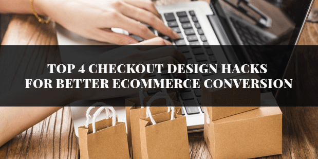
Getting a proper checkout design is a must to bring better conversion in ecommerce business. A properly designed checkout, ought to bring customer experience, building trust and increasing better sales. The opposite of good design, badly designed checkout can create major distraction making the customers abandon the cart right away. It is often seen that marketers give strong emphasis in building other pages of the ecommerce site but tend to neglect checkout page which proves detrimental for the site at large.
If you want to avoid any checkout problem in your ecommerce site, have a look at these hacks:

- Give a simple yet efficient checkout process
Web development company India professionals suggest that getting complexity within an ecommerce site can create huge setback in the conversion. Make sure that the checkout process within the site should be short. Companies should cut the length of checkout process to make people stay on the site.
Secondly, make it completely linear i.e the steps within the checkout process should not repeat itself. This make customers confused and they prefer to leave the site.
- Always offer guest checkouts
Generally, it is important that every online store should offer a guest checkout process. There are several studies which are done in this regard which clearly depicts that online shoppers abandon the checkout process when asked to create a new account. It is quite reasonable to ask customers to register but it shouldn’t be mandatory in any way.
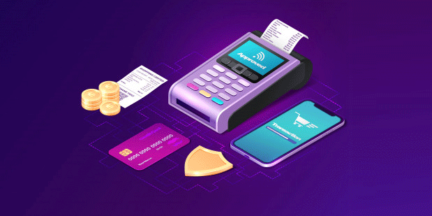
- Enhance the perceived security
When people go for shopping online, said or un-said they are somewhere terrified to give their card details to make a purchase. Research also indicate that around 18% of customers abandon the cart because they cannot trust the website. This lack in trust don’t generally result due to lack of actual security features but from the users perception of website safety.
In order to reduce this feeling within users, experts from ecommerce website development suggest certain indicators such as:
- Display credibility indication within the process. This can be done by trustworthy logos of digital brand, security certificates or unbranded icons which defines safety.
- Give your attention towards visual layouts of the credit card forms. Customer feels this section secured when it is placed within a box with clear border and different background colour.
- In addition to this,make your layout consistent and avoid any visual bugs that can bring suspicion and kills the credibility.

- Localize the checkout process
Ecommerce websites is a global phenomenon. In ecommerce business, even the smallest marketers consider designing the website and the checkout process based on international customers requirements. There are two ways to localize the checkout process. The first option is to localize the payment and currency options. Your ecommerce platform should be able identify IP address to show prices in local currency.
The second method is offering localized inline validation. At least, the form should not show any error when the customers fills an international address or number. Localizing element within checkout process reduces the cart abundance rate.
- Broaden up the bottom of the funnel
Checkout process is the final step of customers journey and the one which owns the largest impact in successful conversion. A small tweaks is also meant to bring better conversion.
Implement these 5 hacks of checkout process within your ecommerce website and witness visible increase in your conversion.