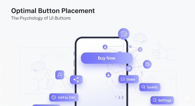
The Psychology of Button Placements in Apps
All the elements of a mobile app hold a lot of significance in deciding what actions users will take. They are the determining factors of how much time a user will spend on the app. Mobile app development companies place special emphasis on UI/UX of the mobile app because, in 2025, app functionality is not everything. What everyone is hinged on delivering is quality user experience. Not designing and placing buttons coherently in a flow is one of the basic UI mistakes that kill conversion.
The button placement in the mobile app is one of the most crucial factors in deciding how much time users will spend on the application. Without a clear design strategy, mobile app development companies struggle to keep users hooked on the interface. Hence, placing buttons reasonably and appealingly is important to let companies retain users for a longer time. In this blog, we will understand the psychology behind the button placement within the mobile application.
How Button Structure and Placement Determine Usability? 5 Things to Look Out For
#1: Keep Button Design Recognisable
You should keep the button design in a mobile application simple and highly recognisable. Recognition in the UI UX design is everything. Things may look fancy on paper or even in mockups, but on the actual application interface, you should design buttons so that they typically look like. When it comes to application design, if users can’t recognise a button easily, it will hinder their experience greatly and impact application usability. A button should be distinguishable from links and other text placements on the application UI. You shouldn’t style them like body text.
#2: Primary and Secondary Buttons Should be Distinguishable
The placement and appearance of primary and secondary buttons are significant in a mobile application. Mobile app development companies create multiple versions of the same screen so that they can determine which performs how when it comes to attracting users and driving action. The colours of the primary and secondary buttons should be distinguishable.
Primary buttons are generally darker in colour. This indicates the psychology that the darker button is the next best step in the process. In a sign-up page, “Sign Up” is the primary button, and “Skip for now” is the secondary button. Users are more likely to click on the primary “sign up” button rather than “Skip for now” if the colours are easily distinguishable.
#3: One Primary Button on a Page
You don’t need multiple primary buttons placed on the mobile application interface. You should have only one primary button on a page so that users are not confused about the ideal next step in the process. You can place secondary and tertiary buttons on the mobile app UI, but placing multiple primary buttons can shift the user’s attention from the primary action they are supposed to take.
#4: Button Placement Only After The Task Completion
Button placement at the end of the task is paramount so that users can finish their action without getting distracted from further actions needed in the app. Your primary button should appear in front of users when they are done thinking. Without properly placing buttons at the end, you can disrupt the user’s flow, which affects their experience. Placing the button where users already are can drive them to take an action. The clear and smart button placement allows users to take action on the mobile app.
#5: Buttons Should Look Different From Links
Note that buttons are not links. You should not mix up the two in any case. Buttons are boxy design elements placed on the mobile app interface that drive action from users. Links are simple text placements in the blue underlined form that drive users from one place to another, much like a button. However, the primary purpose of links is to drive navigation while buttons initiate actions. They let users complete a sign-up process, form-filling, and other such actions on the app.
To Sum Up
The button placement should follow a natural flow in the app interface design. The unnaturally placed buttons feel out of place, like they don’t belong there. Users should follow the natural progression in the app. Hence, placing a button where it needs to be means ensuring proper flow of the mobile application. The psychology behind button placement is that well-designed and placed buttons drive user actions. The missing flow in the mobile app interface can impact the user experience negatively.
To design smart and intuitive applications, our team of developers at VerveLogic, a leading mobile app development company in New York, follows modern procedures and design principles. You can get your hands on a full-fledged app design for your business; you just need to contact our team to get your first brainstorming session. Here, we plan what’s best for your business going forward and help you create applications that don’t just fulfil purpose but are the best at what they do!


