Why Understanding Screen Size and Screen Resolution is Important
When it comes to mobile app development then there are several things that you need to consider to complete the application. To be honest there are so many aspects that you need to consider that you might lose the track of a few things. So, it is advised to be organized before you start the development of any mobile application. Today we want to talk about one such factor which is going to help a lot but it always gets stashed is”Actual Screen of the Different Devices’ ‘.
Screen size and screen resolution are among the two things that you need to keep in mind during the android mobile app development process. It is crucial to take into account because the screen size is important for consumers and in today’s market, there are lots of different screen sizes. No matter whether your development includes Apple or Android, screen resolution needs to be considered because of tons of different devices with several screen sizes.
Resolution is as important as the resolution of different screens can affect how designers build their apps. So as you see, both screen size and resolution size are important. So comprehending the different sizes and resolutions for your mobile application is really important as there are various devices. As the same application is similar to smartphones, tablets, and even smart TVs.

So to make it easy for you, we are here to provide you with the right information to guide you on this crucial topic. If you are in the middle of development or planning to start mobile app development services, we are sure you are going to find this helpful.
How to Calculate Pixels Per Inch
Before we start calculating pixels per inch we first need to understand the difference between the size of the screen and the dimensions of the screen resolution. When it comes to screen size it gets measured using inches as it is the size of the actual screen and the dimensions of the screen resolution. For instance, here we have the screen sizes of various iPhones from Apple that you are all familiar with.
1. iPhone SE – 4 inches
2. iPhone 6s – 4.7 inch
3. iPhone 6s Plus – 5.5 inch
4. iPhone 7 – 4.7 inch
5. iPhone 7 Plus – 5.5 inch
6. iPhone 8 – 4.7 inch
7. iPhone 8 Plus – 5.5 inch
8. iPhone X – 5.8 inch
The measurement of screen size is taken from one corner to the opposite diagonal corner as anyone can do this using a ruler. On the other hand, screen resolution is a little bit different as it is measured by the number of distinguishable pixels that can be displayed in each dimension. If we talk about iPhone X screen resolution then it is 2436 x 1125. While the Samsung Galaxy Note 8 has a resolution of 2960 x 1440.
To calculate the pixels per inch we need to know the size of the screen as well as the resolution along with the below-mentioned formulae:
=> Add the squares of both number in the resolution
=> Take the square root of that number
=> Divide the previous number by the size of the screen
We know it looks a bit cumbersome so let us understand it better with an example.
Let us calculate the pixels per inch (PPI) of iPhone X:
=> 2436 x 2436 + 1125 x 1125 = 7199721(squaring both numbers of the resolution)
=> 7199721/2683.23= 2683.23(square root of the previous answer)
=> 2683.23 5.8 (inch screen) = 462 PPI
According to the Apple technical specifications, their PPI of the 2436 x 1126 pixel 5.8 inch iPhone X is 458, so our calculations weren’t far off. Using this formula we suggest you use this formula to calculate the PPI of more phones from different manufacturers before you start with the iOS mobile app development services.
The main purpose behind this is screen size and screen resolution both play a role in determining the PPI as they can tell you how well an image gets displayed on that particular device.
Let us take the resolution of an old iPhone model like the 4 inch SE and apply it to the 12.9 inch iPad Pro.
Follow the formula using the pixel resolution above.
=> 1136 x 1136 + 640 x 640= 1700096
=> 1700096/1303.88 = 1303.88
=> But now instead of dividing that number by the 4-inch screen size, like you’re supposed to, let’s divide it by 12.9, which is the size of an iPad Pro.
1303.88 / 12.9 = 101.08
As you can see. The PPI is super low, which means that if this resolution were on a larger screen, the images just wouldn’t compute well.
That’s why you need to optimize your images to account for various screen sizes, but we’ll discuss that in greater detail shortly.
Different types of Screens
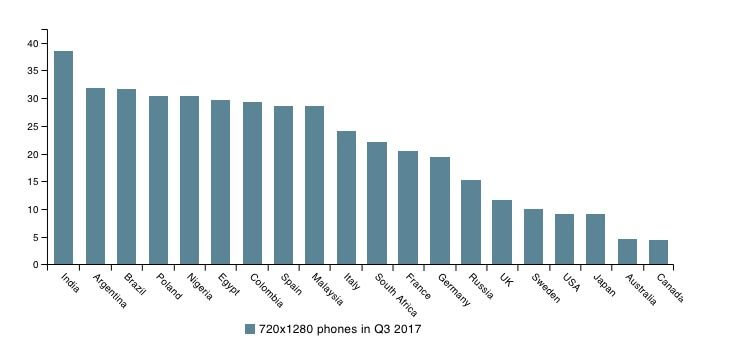
Now that we have already established the screen sizes of different devices. Based on internet web traffic from a global perspective, 720 x 1280 pixel smartphones are the most popular.
As per the above data, the above numbers vary from location to location. This critical information lets you know which types of devices are popular when it comes to the mobile industry. If you are planning to target a particular market then this data can be really helpful. You also need to account for other types of the screen such as:
=> HD screens
=> QHD screens
You need to remember that pixel resolution for high definition is 1920 x 1080. Quarter high definition screens have a 960 x 540-pixel resolution.
How can you Take Advantage of Different Screen Sizes?
Alright. So telephones, tablets, and different gadgets have distinctive screen sizes, goals, and pixels per inch. There are even various kinds of screens.
As an android app developer, you simply need to remember the entirety of this data so that your application is streamlined for the entirety of the various sizes and gadgets.
In case you’re just structuring your application in light of one sort of screen, it will contrarily affect the client experience of different gadgets. Helpless client encounters will hurt your main concern, which is something you clearly need to stay away from.
As a planner, you ought to have the opportunity and adaptability to get inventive with your plans and movements.
Ensure you represent different screen sizes when you’re utilizing Auto Layout to create progressed iOS liveliness.
Here’s another thing to remember. Your application and different pictures actually need to stack perfectly regardless of how the client is holding their gadget.
Believe it or not. Other than the components of their screen size and goal, you’ll likewise need to ensure that there is a consistent change among picture and scene modes.
Contingent upon the size of the screen, clients are bound to lean toward one direction over another. Here’s some information to show you what I’m discussing.
Conclusions
Now that you know the difference between screen size and screen resolution as both of them are really helpful to calculate the pixels per inch of specific devices. For the right mobile app development services, your users must have the best experience, your app needs to be fully optimized for as many devices as possible. So now you know the importance of screen size and screen resolution and how it can manage your mobile app development.


When I first came up with the mobile app for my business it was not at all scalable. Soon I found the mistake and correct it. This is some amazing information. Thanks for this blog.