UI Mistakes That Kill Conversion in Mobile Apps
Your product may be excellent, but if its design confuses users, it will fail. This is true in the case of mobile apps and websites. Without a user-friendly design, companies struggle to make mobile apps stick. With transformative technologies like AI, developers are revolutionising mobile app UX using artificial intelligence. For the success of mobile apps, they should have a good UI that delivers an optimum user experience.
In this article, we will discuss the major UI mistakes that mobile app developers make, which will kill conversions. Let’s dive right into it –
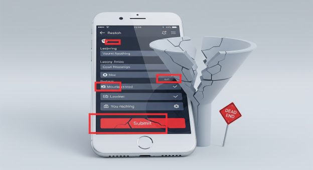
#1: Too Much Clutter on the Interface Confuses Users
Too much crowding on the mobile app interface can hurt the user experience. We say that because clutter in the user interface confuses users.
A cluttered interface affects the conversion rate of a mobile app because users struggle to find what they are looking for. Too many elements on the design interface exhaust the mental energy of users, which leads to app abandonment.
What Can You Do to Make a Mobile App Clutter-Free?
- Developers must adopt clean layout principles to make the mobile app interface clutter-free.
- A clean and well-organised layout will help you make the navigation of the application easier and reduce the clutter.
- To achieve a clutter-free interface, app designers in mobile app development companies should use white space between elements to improve visibility.
- You can separate the content blocks by leaving enough space between them.
- Mobile app designers should work with a grid system, where they can align the elements in a more consistent manner, which will give an organised look.
#2: Mobile App is Extremely Slow in Loading
A slow mobile app is not a good one. It impacts user experience negatively. Users have even less patience when it comes to technology. With many apps and platforms delivering a unique user experience, slow app loading time will hurt your conversion greatly. One of the common app development mistakes is not focusing on its performance.
A good interface cannot do much if the app loading time is slow. After each interaction, if users have to wait for the app to respond, it does not deliver a good user experience.
What Can You Do to Improve the Loading Time of a Mobile App?
- Slow mobile app loading time can be a result of various factors, like using large-sized media.
- Using large pictures or media files in the mobile app can impact its loading time; hence, you should compress the media files and pictures in the mobile app to improve its loading speed.
- You will need steady VPS hosting for the mobile app so that the server supports the rising number of users in the app efficiently.
#3: Confusing or Unclear Navigation
A good navigation allows users to move between different interfaces of the mobile app. Designers use a simple navigation to allow users to switch between the screens efficiently. However, with overly complex or confusing navigation, users cannot find what they’re looking for easily and are most likely to leave. It hampers user experience and negatively impacts the conversion rate.
What Can You Do to Improve the Navigation of a Mobile App?
- To make the navigation easy and efficient for users, you need to keep the menu designs simple. For maintaining simplicity, you can limit the number of options in navigation design.
- The menu items should have straightforward and descriptive names. Clear labelling will help users understand what each one delivers.
- According to the UI UX design principles, the interface should be flexible to use. By flexibility, we mean providing a search bar in the mobile app so that users can locate specific content.
#4: Misplaced or Poorly Placed CTAs
Call-to-action buttons are the indicators that drive customers to take action. However, a badly designed call-to-action button or not including one at all can hurt your conversion.
CTA provides clear direction to the users in the mobile application. Along with this, CTAs also build credibility and trust as they demonstrate a clear path to users that leads to conversion.
What Can You Do to Improve CTA Placement in a Mobile App?
- Mobile app development companies place CTAs in the mobile app interface, essentially to grab users’ attention and encourage action.
- You can include CTAs with a clear colour contrast from the interface that will improve their visibility. To boost recognition, you should focus on the size and space elements.
- The important thing about CTAs is their placement. The goal here is to improve the discoverability of the action button. This is why you should place CTAs where users can find them naturally.
- Your CTAs should show a clear, action-oriented text that compels users to take action. You can use clear, concise and time-sensitive language to create urgency.
To Sum Up
You need to fix the common UI mistakes in the mobile interface to improve its accessibility, visual clarity, speed, and performance. UI impacts the overall user experience. At a time when the attention span of users averages only 8 seconds, your design should be as appealing as the app’s functionality. To drive users towards taking action, app designers should work with UI principles to reduce friction and enhance app usability.
Our developers at VerveLogic, a prominent mobile app development company in Atlanta, offer UI/UX design solutions, mobile app and website development services. You can contact our team to improve your mobile app design that drives more conversions and satisfies user expectations.